Ideally, in order to obtain high quality sample glyphs, one should begin with a high resolution digital scan, since data which has been lost in compression can never be recovered. Unfortunately, such did not seem to be available, as nearly as we could tell.
Adjusting the source information
Consequently, we attempted to remedy the problem in the following way:
- Such scans as are available were saved to a working directory on disc.
- The required number of sample pages were printed using an inkjet printer.
- The GlyphCollector instructions recommend a half dozen or so, and of course one must be mindful of covering the glyph repertoire where possible; 7 pages were chosen for the initial run.1
- The hope was that ink bleed might help to undo the pixellation resulting from the low resolution of the scans.
- The prints were then rescanned in grayscale at 2400 dpi.
- Images were trimmed to near the typeblock and contrast was heightened using GIMP, an open-source tool comparable to Adobe Photoshop and entirely adequate for our purposes.
- The threshold command was used with settings of 0.6 and 1.0.
- Finally, reasonable representations of each glyph were copied and saved, each in its own file, for input to GlyphCollector.
It is worth noting that in our experience, GlyphCollector seemed to isolate additional instances of the glyphs it was given much more rapidly with these doctored high-resolution scans than it had done with an earlier trial at the original resolution!
Producing averaged glyphs
Once a representative glyph has been produced for each desired character, these are fed in to GlyphCollector along with the tidied pages to be searched, and the software endeavours to find other instances of those glyphs.
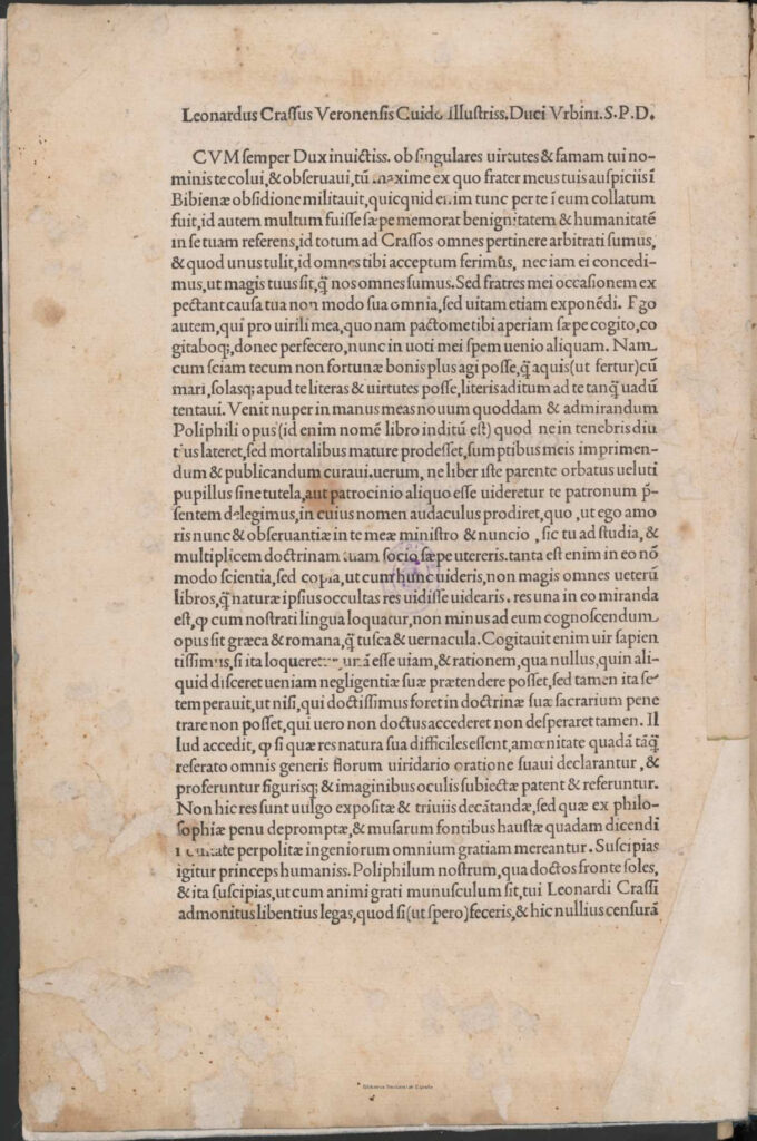
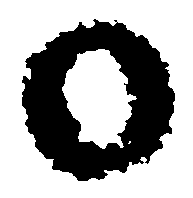
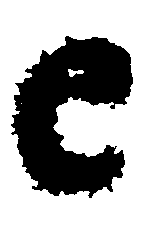
The process is of course not perfect, and misidentifications do occur. For that reason, we reviewed the collection of alternates isolated by the software and removed those which were clearly wrong as well as those whose representation was sufficiently poor that they might negatively affect the process. Once this was done, the software was instructed to produce statistically averaged glyphs. In most cases, a result was produced within seconds; one notable exception, the uppercase ‘M’ took a great deal of time, for some reason. In fact, running it overnight did not lead to completion. However, removal of a few glyphs identified by the software produced a result in seconds.
It is worth noting that the point here is not to reproduce something approaching a final character shape so much as to offer a clearer idea of what the prototypical type shape may have been in order to aid the actual reconstruction using appropriate font design software.
Sample of results
By way of illustration, the first page of body text used is provided below with a diagram showcasing a few model glyphs I had selected for input to GlyphCollector and the results it was able to produce. The averaged glyphs can serve as templates for the actual glyph design.